 Dileep Dilraj

Where it began
That is where this ends up. In this case study I will walk you through how it got there - and the design hurdles I had to clear along the way.
It started with a design challenge I found on sharpen.design: design a pilot logbook app.

Naturally, I did what any curious designer would do - I searched for existing apps and asked ChatGPT about them. Nothing. No case studies, no reference products worth studying. Designing for aviation turns out to be genuinely hard: every country's civil aviation authority sets its own rules (though roughly 90% of them overlap), and on top of that the app has to be both pilot-friendly and dev-ready. That is no small ask.
So there was no shortcut to copy. Fine - let us see what good old H.I. (human intelligence) can do, with a very well-briefed model riding shotgun.
Researching a closed industry
With almost no public data to work from, I had to make my own. I set up a custom GPT and briefed it to behave like a product manager at a fictional company called Jetlog. The task: design a pilot logbook app for cargo flights.
Then I went full UX-nerd mode. I asked the model to interrogate the brief from every angle it could - designers, developers, pilots, QA testers, engineers, cabin crew, even aviation authorities. It came back with 128 questions. I answered around 80 of them, and those answers became the foundation of my research.
It took a solid two days to understand the space well enough to say what this product was actually for. Here is a look at what came out of it.
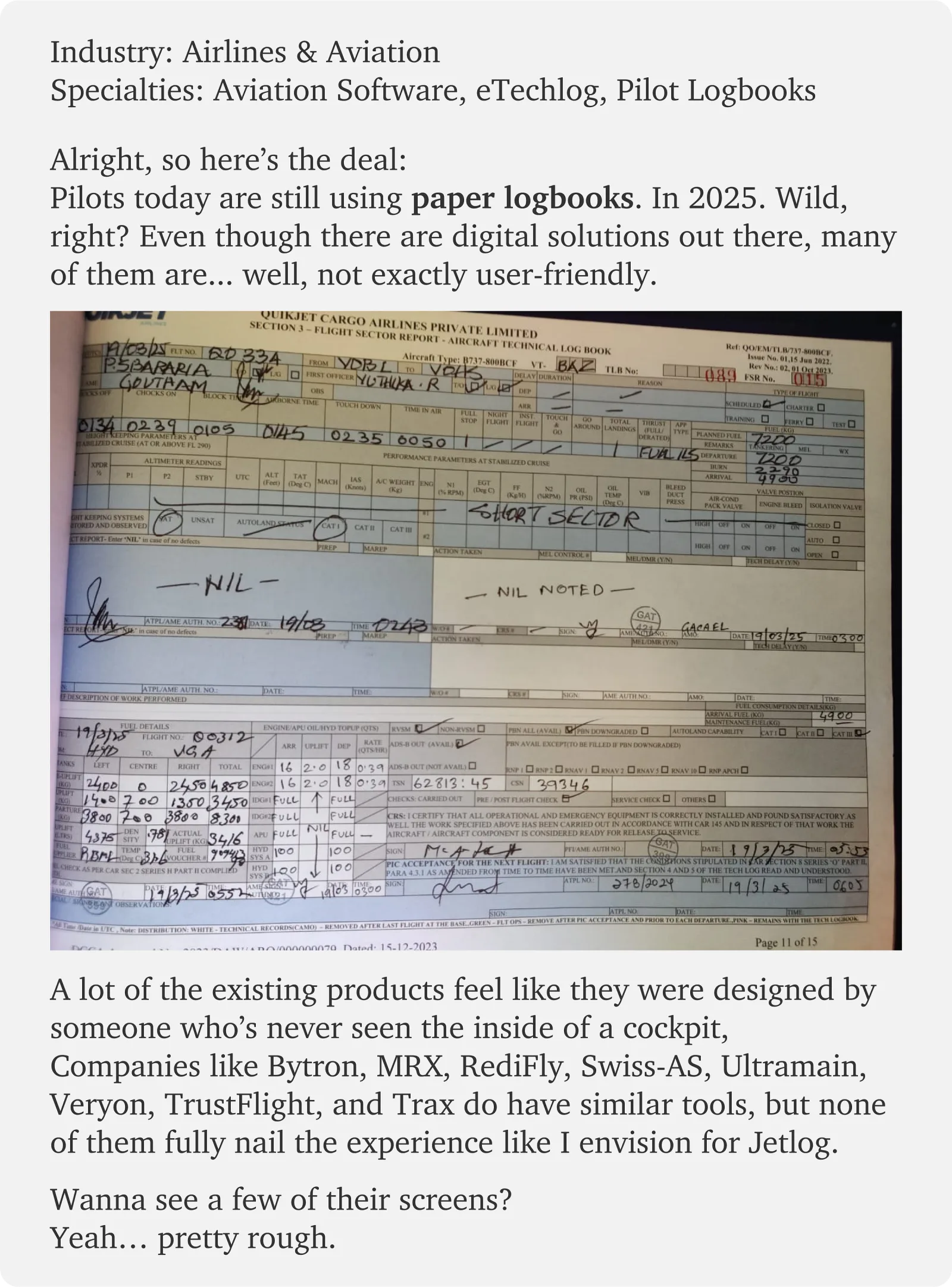
Industry: airlines & aviation. Specialities: aviation software, eTechlog, pilot logbooks.
A lot of pilots are still filling in paper logbooks. In 2025. Digital solutions do exist - Bytron, MRX, RediFly, Swiss-AS, Ultramain, Veryon, TrustFlight and Trax all sell tools in this space - but many of them read like they were built for the auditor rather than the person holding the tablet at 5 a.m.
Dense screens, clunky flows. That gap is exactly what made this worth designing: if nobody has built a modern, mobile-first, pilot-friendly version of this, why not try?
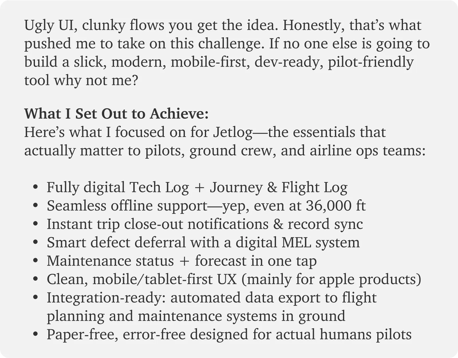
What I set out to achieve
From that research, this is what Jetlog had to do for pilots, ground crew and airline ops teams:
- A fully digital tech log, journey log and flight log
- Seamless offline support - yes, even at 36,000 feet
- Instant trip close-out notifications and record sync
- Smart defect deferral through a digital MEL system
- Maintenance status and forecast in one tap
- Clean, mobile- and tablet-first UX (primarily for Apple devices)
- Integration-ready: automated export to flight planning and maintenance systems on the ground
- Paper-free and error-free - designed for actual human pilots
Jetlog: the smarter e-tech log
A digital tool for pilots and engineers to manage aircraft operations and maintenance. It reports aircraft status, including open defects and MEL (Minimum Equipment List) items, and lets crew log fuel, oil, hydraulics, flight checks, engine and APU performance, and in-flight observations.
It covers all three flight phases - pre-flight, in-flight and post-flight - along with delays, autoland status and altitude accuracy. Going fully digital improves safety, simplifies compliance and keeps flight crews and ground staff in sync. No paper, no confusion.
The core problem
Pilots have to complete 126 fields for every single flight. For cargo pilots flying around five sectors a day, that is 630 fields daily. Six hundred and thirty. No wonder paper still wins - at least paper never asks you to log in.
Every one of those fields is mandatory - aviation rules are not negotiable - so the number could not come down. The effort behind it could. My goal was to cut the physical and cognitive cost of each entry: break the data down into small, obvious steps, put each one where the pilot already is, and never make them hunt.
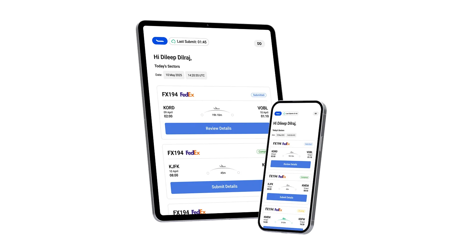
So Jetlog is mobile- and tablet-first and works fully offline. Entries are held on the device and sync to the cloud the moment there is a connection, and the app checks that every required field is filled before a form can be submitted - so nothing critical slips through.
The design
I cannot fit the whole research process into one article without turning it into a boxed set, so what follows are the six decisions that shaped the product most - and the real-world problem each one is answering.
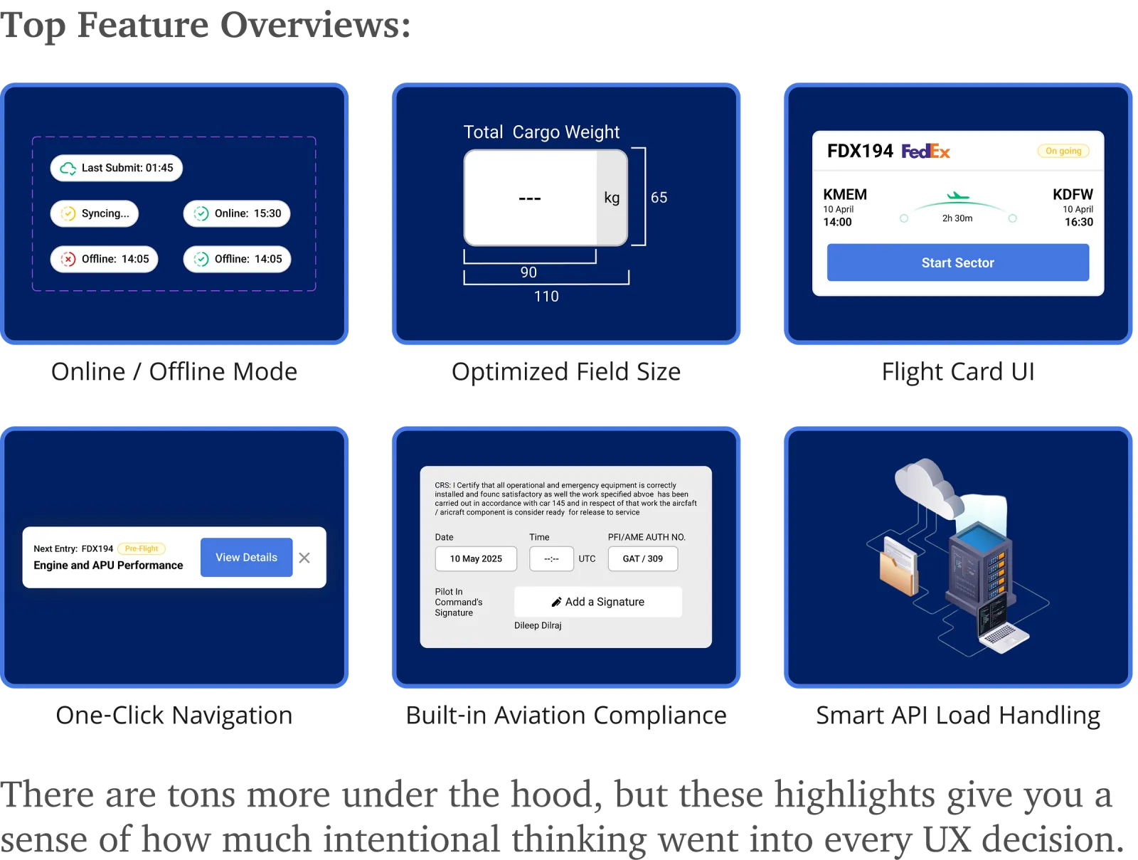
1. Online / offline mode
This is a pilot's app. Its users cross time zones at 36,000 feet, where in-flight Wi-Fi is optimistic at best. Real-time syncing is not something the design can assume.
So Jetlog works the same online and off. Every field the crew enters is written to the device first, and the app pushes it to the cloud on its own as soon as a connection comes back. No manual uploads, nothing to remember.
The harder part is trust: if a pilot cannot see that their data is safe, they will write it on paper as well. So each screen carries an explicit status.
- Last submit Green cloud - this log reached the cloud, and when.
- Syncing Amber - data is on its way up in the background.
- Online Green tick - you are connected and safe to submit.
- Offline, saved Dashed green - no signal, but the entry is safe on the device.
- Offline, not saved Red - the write failed. The app retries every two minutes.
Every one of those icons is tappable, and tapping it explains in plain language what is happening and what, if anything, the pilot should do. A status light that cannot answer a question is just decoration.
2. Optimized field size
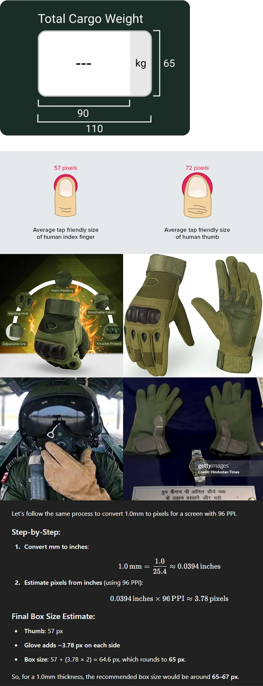
At a glance this looks like I simply made the inputs big. There is a number behind every pixel.
Research on touch targets puts the comfortable size at roughly 72px for thumbs and 57px for index fingers. But cargo crews often work in gloves, and a glove is padding between the fingertip and the glass: it spreads the contact patch and conducts poorly, so precise taps get unreliable.
So I sized the fields for the gloved hand, not the bare one:
- Average glove padding ≈ 1 mm ≈ 3.78px per side
- Index finger (~57px) + padding on both sides ≈ 64.6px
- Rounded to a 65px field height
Width follows the same logic. I set it 25px wider than the height - 90px - because nobody lands dead-centre every time, and added another 20px for fields carrying a suffix such as kg, % or m, so the unit never crowds the value.
The result is an input that stays hittable in gloves, in turbulence, at 5 a.m., which is when most of these get filled in.
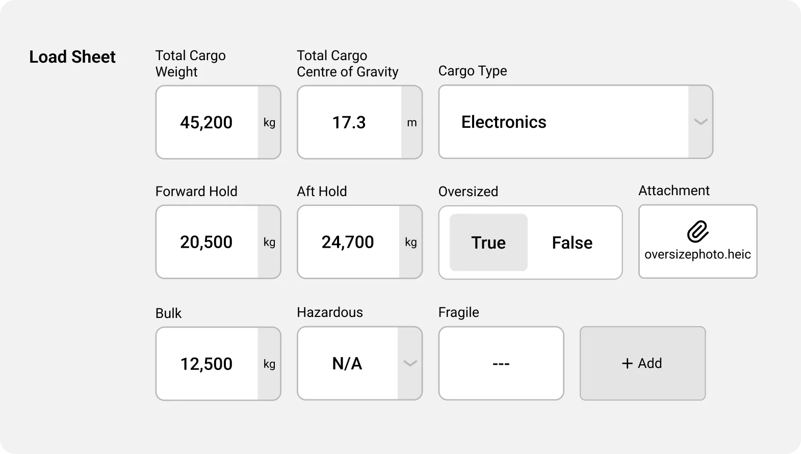
Because this is a cargo app, the fields that get this treatment first are the ones a pilot reaches for most - starting with the load sheet.
3. Flight card UI
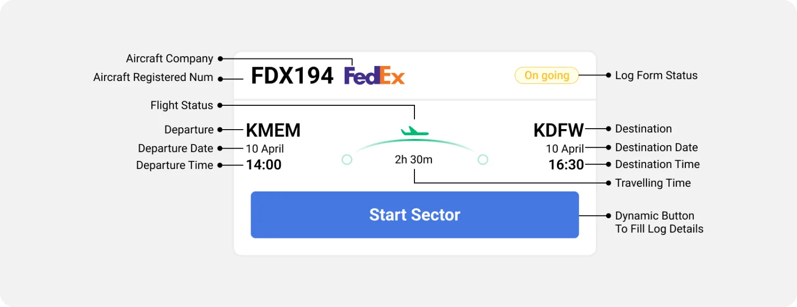
The flight card is the home screen's main object, and it is built for a trained professional rather than someone booking a holiday. Pilots work against strict duty hours across multiple time zones, so the card has to be scannable in a second and defensible in an audit.
One card, one sector
Each card is a single sector - one departure to one destination. When a pilot is assigned to a flight, the card appears on their home screen with departure, arrival, date and time. Airport codes stay in the form pilots already use, so there is nothing to decode.
UTC only, on purpose
Pilots cross borders every day, and juggling local time zones is how logs end up wrong. Every time in Jetlog is UTC, which is the standard airlines already work in and the one FAA and TSA audits are read against.
Whose aircraft is this?
Cargo pilots may fly for more than one operator depending on the assignment, so the card carries the operator's logo. Instant context, no reading required.
Aircraft registration first
Like a car's number plate, every aircraft has its own registration, and pilots are assigned to a specific one. It sits in the top-left corner - where eyes start - so the most consequential fact on the card is the first one read.
A button that knows the phase
Flights run in three phases: pre-flight, in-flight and post-flight. The card's action button follows them. It wakes up an hour before departure for pre-flight checks, changes during the flight, and changes again after landing for post-flight logging.
That single rule does a lot of quiet work: there is only ever one obvious thing to do, so the pilot touches the log when it matters and ignores it when it does not.
4. One-click navigation
Those 126 fields are not filled in one sitting. They are spread across pre-flight, in-flight and post-flight, and grouped into sections - Fuel, APU, Servicing and the rest. Which means finding the next field is its own task.
Originally, reaching something like "APU Start Result" meant tapping through:
Select flight → Status → Section → Group → Field
Five taps to log one value.
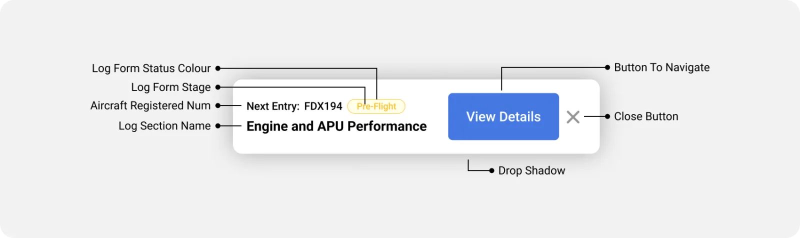
Not ideal at 36,000 feet with one hand on the yoke. So the app carries a dynamic CTA that collapses all of that into a single tap.
How it picks the next field
The bar suggests where to go next based on three things:
- The current flight phase (pre-flight, in-flight or post-flight)
- The last field the pilot filled
- The last section they visited
It works like a co-pilot for the paperwork: it keeps the place so the pilot does not have to.
Why it matters
Pilots open this app 10–15 times per flight, in the gaps between flying and resting. Saving four taps each time is not a small win - it is most of the interaction.
Helpful, not pushy
The bar sits in a non-intrusive bottom sheet and can be dismissed at any point. A tap on the shoulder, not someone shouting instructions in your ear. Small feature, outsized effect on the flow.
5. Built-in aviation compliance
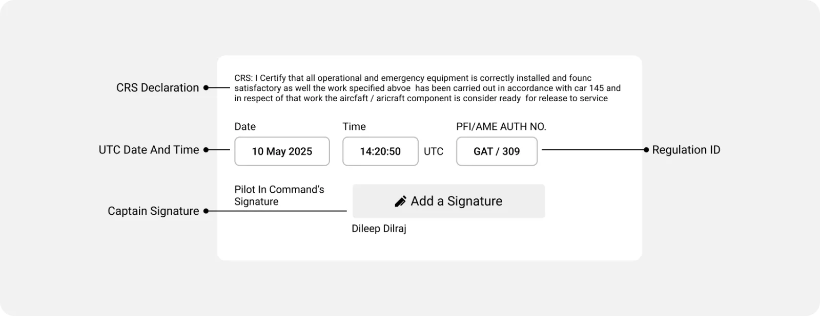
Being a pilot is not only about flying the aircraft - it is about safety, responsibility and compliance with strict regulation. Every log or maintenance report has to be acknowledged as accurate by the person who filled it in. That acknowledgment is mandatory, and it is what an audit actually looks at.
Why compliance shapes the UI
Aviation authorities require an acknowledgment against each entry, whether the logbook is paper or digital. I wanted Jetlog to carry that weight visibly, so the digital version feels as formal and as trustworthy as the book it replaces.
Sign once, not sixty times
Rather than making pilots sign off again and again, they add their signature once in profile settings, stored locally on the device. The app then applies it to every form they complete that day - the same legal record, without the repetition.
Regulations that vary by flight
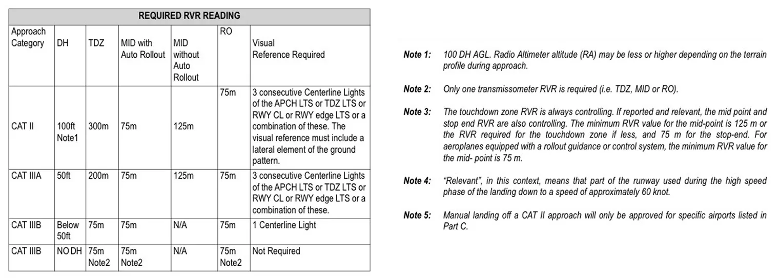
The rules depend on the operator, the aircraft's country of registration and the approach category flown - CAT I, CAT II, CAT III. Jetlog adapts the compliance workflow to those variables, so each pilot sees the requirements that apply to them and not a generic form.
The result is an app that is convenient and defensible: it makes the fast path and the compliant path the same path.
6. Smart API load handling
A design that is expensive to run does not ship. Real-time databases are excellent and costly, especially with a fleet's worth of users writing constantly - so how and when Jetlog talks to the server is a design decision, not just an engineering one.
Local first, so nothing is lost
- Offline: in weak-signal places - small airfields, cruise altitude - entries are written to the device and held there. Nothing depends on a connection.
- Online: once the device has a signal, the app submits a form only when every required field is filled, so half-finished records never reach the record system.
- Manual backup: pilots can export their offline data as PDF or CSV from the profile section - a personal copy, and something to hand over if the airline asks.
Batching, so it stays affordable
On arrival, a whole day's logs can go up in one submission. Batching cuts the number of database writes dramatically, which lowers server load and cost for the airline - the difference between a few submissions per pilot per day and thousands across a fleet.
Automatic end-of-day submission
At the end of the day, as soon as the device is online, the app submits every form from that day's flights by itself. Nobody has to remember to send yesterday's paperwork.
An API for audit and analytics
Airlines often have to share flight data with authorities for audits or analytics. Syncing that securely through an API is what lets the airline meet its reporting obligations without anyone re-keying a logbook - better transparency, fewer transcription errors.
Before and after
Six decisions, one job: the same 126 fields, filled with far less effort. Here is what changes for the pilot doing it.
| The moment | Paper tech log | Jetlog |
|---|---|---|
| Reaching one field | Find the book, find the section, find the row | One tap from the next-entry bar |
| Filling it in | Pen on paper, gloves off | 65px targets sized for a gloved finger |
| Working with no signal | Always offline - and always re-keyed later | Saved on the device, synced when signal returns |
| Knowing it is safe | You assume it is | An explicit status on every screen |
| Signing off | Sign every form, every time | Sign once a day, applied automatically |
| Catching a gap | At the audit, weeks later | At submit - incomplete forms cannot be sent |
| End of day | Hand the book to ops and hope | One batch submission, or automatic once online |
Being straight about the numbers: Jetlog is a concept, not a shipped product, so there is no adoption data or measured time-saving behind it. Everything above is a design claim traceable to the research and the interaction model - the honest next step is putting it in front of real line pilots.
Good design feels effortless. It does not shout, and it does not get in the way. It quietly solves a complicated problem in the background, so the person using it never notices the work that went in.
Simple. Seamless. Invisible. Just the way pilots like it.
Future plans
Aviation is one of humanity's great achievements and one of its most complex industries. A pilot logbook is one small corner of it, and there is a whole sky left.
This round was about pilot productivity. The obvious next move is the other side of the operation - the admin teams who assign sectors, review submitted logs, generate printable reports and prepare for audits.
Modules I would design next:
- Flight operations
- Aircraft management
- Maintenance (MRO)
- Crew scheduling & management
- Cargo handling
- Billing & invoicing
- Safety & compliance
- Analytics & reporting
The journey is not over - it is just cleared for take-off.

What I learned
This project taught me more than design. It opened a window onto how aviation actually runs behind the scenes - and left me with a lot of respect for the people who keep it moving.
Prompting is a research skill
Most of my domain knowledge came from AI, and getting usable answers out of it was work in itself. Aviation data is thin and often private, so it took a lot of iteration - plus YouTube, books and blogs - before the model's answers were specific enough to design from.
Device reality comes first
Because of security and safety protocols, many aviation companies standardise on iPhones and iPads: reliable, locked down and easy to carry. Designing for what crews already hold beat designing for what I would have picked.
Aviation speaks its own language
What I would call an aircraft, an airline may call equipment. A flight leg is a sector. Airports carry both a three-letter IATA code (LAX, DXB) and a four-letter ICAO code (KMEM, KDFW), and pilots use the latter. Learning the vocabulary was the price of entry.
Regulation is a design constraint
Keeping the interface simple while satisfying aviation authority guidelines was the hardest part of the project. It taught me to treat the rules as material to design with rather than an obstacle to design around.
Wrapping up
That is a lot of information - which is rather the point of a case study. When something looks simple on the surface, it is usually because a few hundred decisions were made underneath it.
The short version
- Designed a flight log app for cargo pilots, inside real aviation compliance constraints.
- Solved for offline use, gloved input and 126 values of data entry per sector.
- Used AI as a research engine, backed by my own reading and judgment.
- Kept it grounded in real-world usability and buildable by a dev team.
Note: this was a personal challenge to see how far generative AI could carry real-world UX work when it is backed by industry-level thinking. I paired what the model gave me with my own judgment and levelled up a fair amount along the way.
The goal was to sharpen my UX thinking, push Gen AI as far as it would go, and solve a real aviation problem. Let us keep building smarter, more human-centred systems. Thanks for reading ✈️